
Core Supply & Demand
Half a dozen supply and demand zones can sit on the same chart, and they all look equally worth trading. Core Supply & Demand [ZynAlgo] scores each zone by the volume that built it, so the ranking is done before price comes back.
Key benefits
- A strength score on every zone - each box prints its net volume and a Power reading from 1 to 10 taken from the flow behind it.
- Fresh or already tested, at a glance - a solid border means untouched, a dashed border means price has been in and taken part of it.
- Markers that wait for rejection - a diamond prints only after the bar closes back outside the boundary, never on the first touch.
- A live panel of active zones - the five most recent readings on each side, side by side in one corner table.
How it works
A zone is only created when a three-bar sequence forms on volume above the running average, which leaves out moves that merely look the part. Each surviving box is measured against the flow held by all tracked zones, scored, then watched for testing, mitigation or invalidation. Full walkthrough in the Manual.
What's included / Platforms
- TradingView indicator, Pine Script v5, added to your TradingView username once access is granted. Released to ZynAlgo VIP members.
Best for
Intraday and swing traders on volume-bearing markets - futures, indices and crypto - who work from supply and demand levels and want them ranked before planning an entry.
Get started
Browse the ZynAlgo marketplace
Disclaimer: an analysis tool, not financial advice or a signal service. Zone scores and markers are context only, and no indicator removes market risk - trade with your own plan and position sizing.
Core Supply & Demand
Ranking supply and demand zones by the volume that built them
Any script can outline the last three-bar push and call it a zone. The difficulty starts afterwards: several boxes sit on the chart, they all look alike, and only one of them was built by real participation.
Core Supply & Demand narrows the field before you have to choose. To do that it works with:
- three consecutive bars in the same direction, which is what starts a zone,
- a volume check on that sequence against the running average of recent bars, which decides whether the zone is worth drawing at all,
- the net directional volume accumulated across the bars that formed it, which becomes the zone's score,
- long-term ATR, which sets how thick the box is,
- and every later interaction between price and the box edges, which decides whether the zone stays fresh, turns mitigated, or is dropped.
The result on TradingView is a small set of ranked zones instead of a chart full of equal-looking rectangles. It is a context and mapping tool for your own analysis, not an automated entry system.
Reading the zone label
Every box carries one line of text at its right edge, and that line is the point of the whole tool. Two zones can look identical on the chart and deserve completely different amounts of attention.
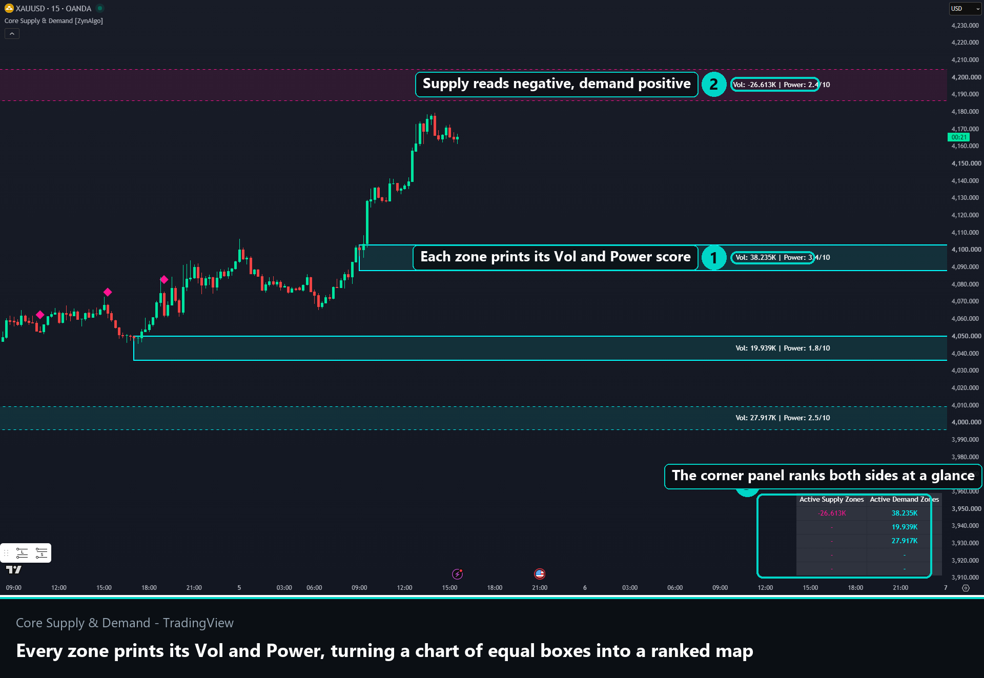
- Vol - the net volume accumulated across the bars that formed the zone. It runs positive on the demand side and negative on the supply side.
- Power - the same figure expressed from 1 to 10, by comparing it against the flow held by every zone the indicator is currently tracking.
- A high Power reading means the zone holds a large share of the participation on the chart right now. It is a comparison between zones, not a probability.
- The panel in the lower right corner lists the most recent readings for both sides, so you can see which side is carrying more without reading each box.
Common mistake: treating every rectangle as equal. A zone scoring 1.2 and a zone scoring 8.5 are drawn the same way and mean very different things.
How zone state is defined
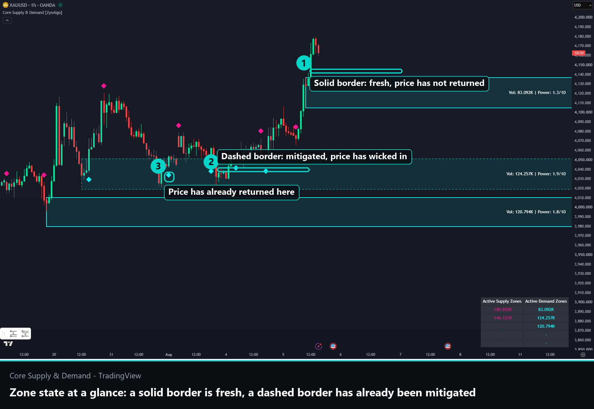
- Solid border, fresh - price has not returned to the zone since it formed.
- Dashed border, mitigated - price has already wicked into the zone at least once, so part of what was resting there has been absorbed.
- Dropped, invalidated - a supply zone is removed when a bar closes above its top, a demand zone when a bar closes below its bottom. A zone price has closed through is no longer a zone.
- Chart budget - only the five most recent zones per side are kept, and boxes nested inside one another are cleaned up automatically.
Fresh zones are the ones worth watching for a reaction. A dashed zone works better as a reference area for a position you already hold than as a fresh entry, because the orders that made it meaningful have partly been filled.
Reading the diamond markers
A diamond never prints simply because price reached a zone. Three things have to line up on the same bar:
- Penetration - the low reaches into a demand zone, or the high reaches into a supply zone.
- Rejection close - the bar closes back outside that boundary and in the matching direction: a bullish close above the top of a demand zone for Zyn Buy, a bearish close below the bottom of a supply zone for Zyn Sell. This close is the actual event, not the touch.
- Spacing - Signal Coolbar sets the minimum number of bars between two markers in the same direction. It defaults to 10 bars.
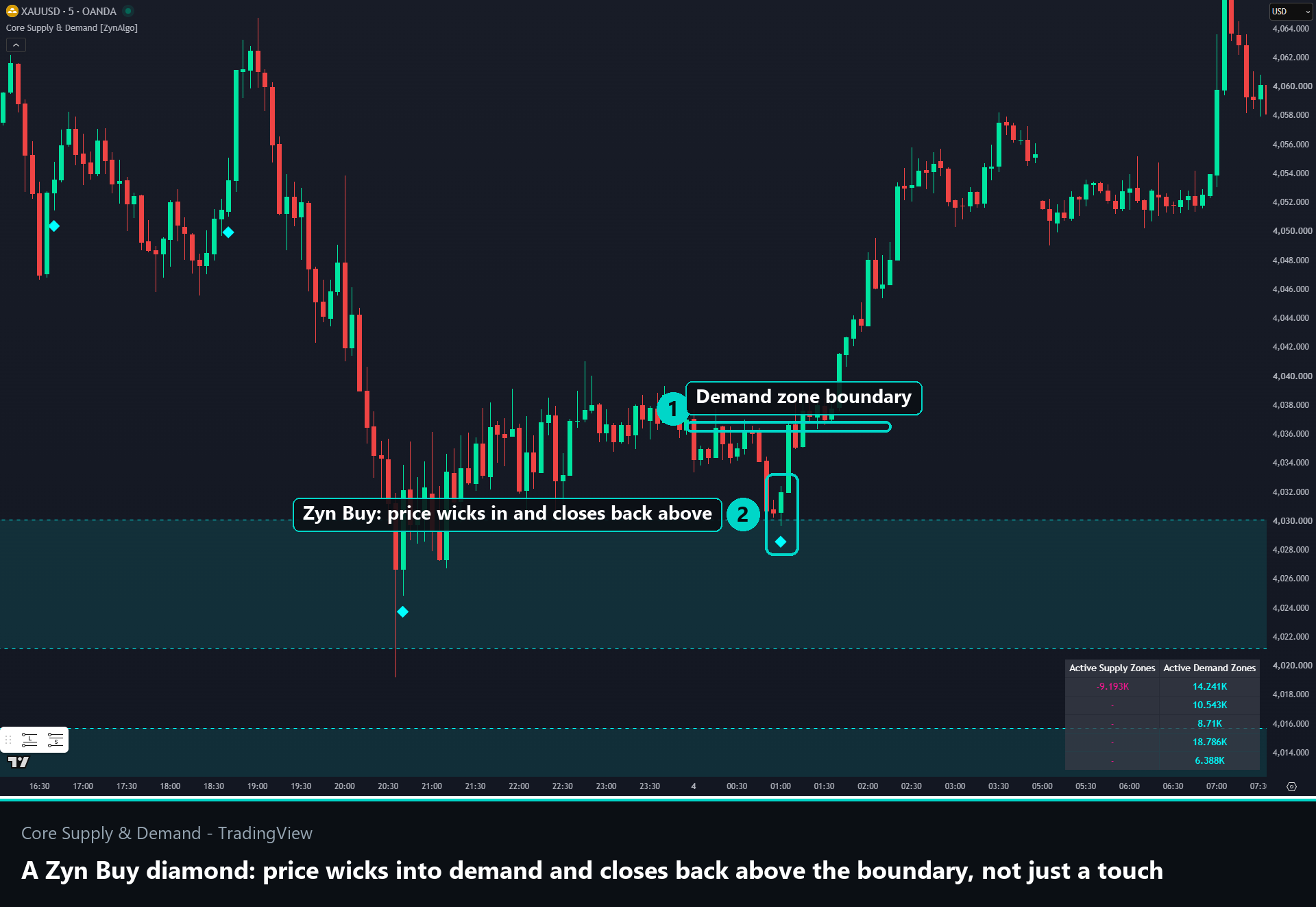
The spacing rule matters more than it sounds. Price grinding along a zone edge would otherwise produce a run of diamonds describing one indecisive stretch. On fast intraday charts raise the value for stricter filtering; on higher timeframes a lower value is usually enough.
A practical routine around the markers:
- favour fresh zones with a higher Power reading over dashed ones,
- wait for the close outside the boundary instead of resting an order inside the box,
- check the panel to see whether both sides agree with the direction you are considering,
- and remember a zone is invalidated by a close through it, which is where your risk level naturally sits.
Best suited for
- Supply and demand traders - you want your levels ranked by participation instead of treated as equals.
- Traders who have been filled inside a zone - a limit order resting in the box gets hit whether or not the zone holds, while a rejection close is a stricter trigger.
- Intraday and swing traders on volume-bearing markets - futures, indices and crypto. On spot FX the feed is tick volume, so read the score as a rough proxy there.
- Traders who already own an entry method - this tool supplies context and levels, not a system to follow blindly.
Settings are deliberately short: two zone colours and one spacing filter. There is nothing to curve-fit, which keeps the attention on the chart rather than on the inputs.
Browse the ZynAlgo marketplace
Risk note: Core Supply & Demand is an analysis tool. It does not place trades, it cannot know what price will do next, and no indicator removes market risk. Always trade with your own plan and position sizing.
- Core Supply & Demand [ZynAlgo] v1Aug 13, 2026